Welcome to the second part of our basic trading educational series! You can find our first article on beta here. Previously, we learned that beta measures the magnitude of a price movement, and looked at beta as a measure of systemic risk.
Crypto Correlations Part 1: An Introduction to Correlation
By Tommy Schreiner
April 18, 2021
Correlation is a close cousin to beta, so let’s introduce it to our family of trading tools.

The early bird gets the worm.
Most people who read this article love crypto.
We are all intuitively familiar with relationships. We often make observations in our daily lives, valid or invalid, based on our understanding on how one variable directly affects another variable. For example, you may hear or make any of the following generalized observations in your daily life:
John is 6 foot 7, he must wear large shoes.
People who make more money spend more money.
If a student studies more, their test scores will increase.
These are all true: most tall people wear larger shoes, wealthier individuals do spend more money (they have more to spend!), and studying should improve your test scores. There are exceptions of course, but when the relationship between two variables behaves consistently, it has a strong correlation.
Correlations exist not only in our everyday lives, but in the price movements of assets as well. Here are a few generalized price relationships you may have heard circulating in the twittersphere:
When the US dollar goes down, bitcoin goes up (and vice-versa).
Bitcoin moves in concert with the price of the S&P 500.
Bitcoin tends to perform the best on Saturdays (h/t marketsscience.com).
These relationships are true at times, sometimes not at all, and sometimes the complete opposite! So in order to determine how long these relationships have occurred and to what degree, we need to understand how to read, measure, and chart the raw correlation values for our needs as analysts. Let’s dive in!
Correlation by numbers
Correlation is a measure of the extent to which two variables “move together” over time: when one variable goes up in value, the other one does as well (and vice versa). Correlation is a helpful tool for measuring simple relationships between variables.
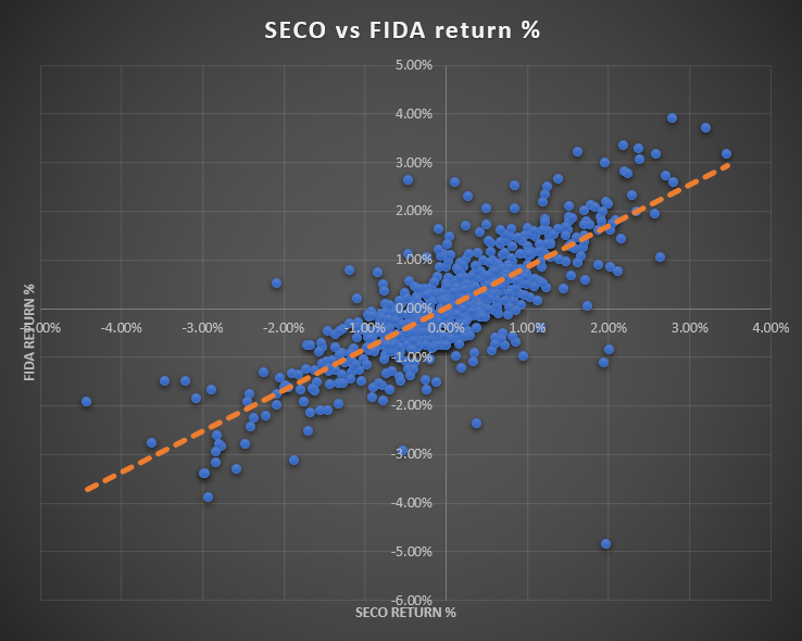
When looking at correlations, it can be informative to either plot the two variables over time or plot them as scattergrams, both shown below. Long story short, if the dots on the scattergram nearly form a straight line, there is a correlation between the variables. The closer the dots are to the line, the higher the correlation value (R) is. In the examples below, r is written above each scattergram.

Chart: visualization of r values

Chart: scatterplot of FIDA vs SECO showing 0.79 r correlation
Correlation “R” us

Compared to beta, correlation values are much more straightforward. The correlation r values above range from positive 1 to negative 1.
1 is a perfect correlation.
Values closer to 1 have stronger correlation.
Values closer to 0 have weaker correlation.
0 is perfectly uncorrelated.
Values closer to -1 have stronger negative correlation.
-1 is a perfect negative correlation.
In some forms of research, analysts will ignore values that aren't considered “strong” (above and below +0.8 / -0.8), but as traders and investors, a weak correlation can be just as useful as a strong correlation. Some investors prefer to hold an uncorrelated portfolio to reduce their exposure to market shocks, and some investors prefer to maximize their correlated coins as proxy-leveraged positions, as we discussed in our beta article.
Warning! Keep in mind that just like beta, correlations can change suddenly. Correlation only measures what has happened and cannot predict what is going to happen.
Without further ado, let’s take a look at a real-life example. Below is a price chart of the last 30 days of SECO, which is a Solana ecosystem basket of coins listed on FTX, and Bonfida (FIDA), which is a coin built on Solana and is part of the basket. Theoretically, they should behave similarly so it’s a good example to test our hypothesis.
Chart: SECO vs. Bonfida hourly price chart from 3/16 to 4/15
A quick glance at the price chart and the naked eye can easily tell there is a kind of relationship at play between the two assets. In some fashion, they are moving together. We could say they are correlated, but by how much and for how long? Well, the 30-day price correlation of the two assets is 0.99, which we found by using Excel’s =correl(x,y) formula on the two price datasets. That’s almost a perfect correlation!
This is just one way of looking at correlation. If you’re a long term investor or swing trader, taking a snapshot of the 30-day correlation will tell you that in general, the two assets have moved up together over the same time period, which you can visually tell by glancing at the price series above. Quite simply, SECO and FIDA in the last 30 days, go up together.
What about intraday movements? What the r value of 0.99 doesn’t capture is how the assets have moved in the time periods between the first and last data points: March 16th and April 15th. A more nimble trader, who may take on more than 5 trades per day, might be more interested in what is happening on the day to day, or in this case, the hour to hour.
The solution: normalize by return percentage.
Normalizing with returns
By calculating the returns for each asset and measuring the correlation between their returns, we can take a finer lens to our dataset. For the purposes of measuring the hourly correlation between SECO and FIDA, we are going to take the simple step of converting the prices of the two assets to a return percentages, which looks like this:
(Current price / Last recorded price) - 1

Price and hourly returns of SECO and FIDA
This data analyzes hourly closes from March 16th to April 15th. Once we have converted all our price data to return percentages, we’re going to analyze the 30-day correlation once again. Remember that the 30-day correlation of price data was a whopping 0.99. Now that we have converted all the price data to return percentages, we’ll run the Excel correlation formula =correl(x,y) again, this time on the return % columns.

The correlation of returns is less correlated than the price data; however, both pieces of information are valid depending on your strategy! The difference is time preference.
On the one hand, an investor with higher tolerance for intraday changes may not be as interested in how the assets move independently on a day to day basis and is more concerned with whether they move together as a whole. In this case 0.99 tells an accurate story of how the prices moved in the last 30 days.
For the intraday trader, who might be levered and more exposed to intraday percentage changes, 0.79 is the more relevant data point to their trading strategy. For their purposes, this more accurately captures what has occurred in the returns on a day to day basis. Part of the reason this occurs is because the returns between the assets have outliers, so days where one asset has an outsized return versus the other asset affects the correlation score. This granular look at correlation can be very helpful for making lower timeframe decisions.
Now we’re going to throw another wrench in the works. Notice that the correlation r value 0.79 measures still only one point in time. In other words, as of today, we know that the last 30 days of 1-hour returns between SECO and FIDA measured 0.79, a strong correlation. What we don’t know is how that relationship changed and evolved over time. There are certainly days where returns have been more or less correlated within that 30-day period. To address this, we can recalculate the correlation in a 3-day moving window to analyze how this relationship changes over time.

Chart: 3-day correlation window of SECO vs FIDA from 3/19 to 4/15
Take a look at the chart above. Now we can more clearly see how the correlation has weakened, at times dropping below 0.8, and strengthened again, at times touching 0.9. Why do these measurements look slightly different than our 30-day correlation of returns that gave us 0.79?
For this particular dataset, we applied a 3-day window on the correlation coefficient. In simpler terms, if you take a data-point on April 3rd, it’s only looking at three whole days (April 1st to April 3rd). Similarly, the next day on April 4th, the data collection window moves up a day to measure April 2nd to April 4th and so on and so forth until we reach the present day.
So while 0.79 measures the correlation over the whole 30-day period all at once, applying a 3-day window allows us to see how the correlation changes over time. What lookback window you apply to your dataset is up to you, but consider the implications when you choose your window. For example, a 1-day lookback window may be too granular to make decisions for your swing portfolio, as the correlation value would react too fast to the incoming data. Conversely, a 365-day lookback wouldn’t be reactive enough to make decisions for intraday trades, as each new data point would barely make a dent in the massive dataset.

Interestingly, it is worth noting that the correlations calculated in the smaller windows may be vastly different than the single overall correlation. For example, all of the 3-day correlations could potentially be under 0.2, but the overall correlation may still be high (e.g. 0.8). In other words, the day-to-day correlations do not necessarily correlate with longer term trends.
Additionally, you can use multiple windows of correlation to get a more complete picture of the relationship between assets. The chart to the right is an example of the DEFI-PERP index and all the individual coins that make up the basket measured against the 1-day, 3-day, 7-day, and 30-day correlation of bitcoin. This is just one way of distinguishing between short, medium, and long term correlations. In this particular example, I have chosen to highlight r values above 0.7 in green and r values below 0 (negative correlations) in red. This makes it easier to tell some of the more important correlations at a glance.
Correlation station: some idea generation
So far we’ve identified that assets can correlate for a period of time, we normalized the data for accuracy, and we understand that specific lookback windows can be used for different trading styles to track assets as they come in and out of correlation. But all we have looked at are two assets: FIDA and SECO, the latter of which is an index made up of the former! Why would we look at their relationship, or for that matter, any relationship between assets?
We could spend an additional article talking about the multitude of possibilities and reasons to track correlations, but I’ll provide some popular ideas and concepts for you to use as a springboard to generate your own research:
- Individual asset vs. an index. The most typical example of this is any individual stock name against the S&P 500. Some investors may seek to diversify their holdings into assets that are less correlated to the overall market as a way to reduce their exposure to the overall market and smoothen their returns. Other investors may wish to follow the strength and make sure their investments are still tracking the benchmark. This type of correlation is exactly what we measured with SECO vs. FIDA to determine how correlated FIDA might be to the overall basket of Solana coins.
Other examples of this are:
Any coin against BTC or ETH (bitcoin/ethereum acts as the index)
Synthetix against DEFI-PERP
Kusama against a Polkadot index (construct from top ~10 DOT coins)
PancakeSwap against a Binance Chain index (construct from top ~10 BSC coins)
- Sector correlations. Similarly, tracking sectors against each other can play an important role in following capital rotations, as early correlation or de-correlation can be a tip-off that a basket of coins is receiving attention.
Some examples of this are:
DEFI-PERP vs. SECO-PERP
SECO-PERP vs. ETH
Polkadot index vs. Binance Chain index
Lending platforms vs. DEXes
Privacy coins vs. AMMs
Layer 1 vs. Layer 2
- Legacy vs. crypto correlations. Most of these come from different narrative cycles that have played out over the years: increasing Chinese investments, devaluation of the dollar, risk-off asset vs. risk-on asset, and so on.
Here are some examples you may have heard of:
Bitcoin vs. Chinese Yuan
Bitcoin vs. Gold
Bitcoin vs. S&P 500
Bitcoin vs. Bonds
Bitcoin vs. Dollar
Correlating with Nicolas Cage

Now is a good time as any to introduce the customary warning: correlation does not equal causation.
Just because something shows high correlation doesn’t mean they are actually caused by each other. If you look at the charts below and take them at face value, you would think that Nicolas Cage has a very difficult decision to make. If he continues acting, people will drown in swimming pools. If he doesn’t continue acting, people will die in helicopter accidents. Obviously, this is not the case; people will drown and die in helicopters whether or not Nicolas Cage graces us with his magnetic screen presence.


Charts courtesy of https://www.tylervigen.com/spurious-correlations
Sometimes there is a third and hidden factor that informs both variables. For example, both ice cream purchases and murders are correlated, but clearly one does not cause the other. Warmer weather and the approaching summer months, however, do cause more people to buy ice cream and murders to become committed.
Keep these relationships in mind when exploring your own correlations, as a lot of correlations can link back to a major index and/or coin such as bitcoin or ethereum. Those crypto mainstays could in turn suddenly and violently correlate with the S&P 500 in a crisis, as they did in March of 2020.
Wrapping up
Hopefully by this point you’re already excited about testing or exploring some correlations and see the potential in tracking the relationships of multiple assets. You know now how to normalize an asset’s returns to prepare for correlation and how to apply lookback windows to suit your trading needs. You also have a basket of ideas to try, from individual to sector to legacy correlations, as well as words of caution from Mr. Nicholas Cage.
Check back soon for Crypto Correlations Part 2, where we’ll continue building on this foundation. I’ll show you how to build the Excel charts in this article, some scatter plot charts (like the one below), and correlation matrices as we explore more fun crypto correlations!
Chart: FIDA vs SECO correlation scatterplot
Stay up to date
Sign up to receive an email when we release a new post